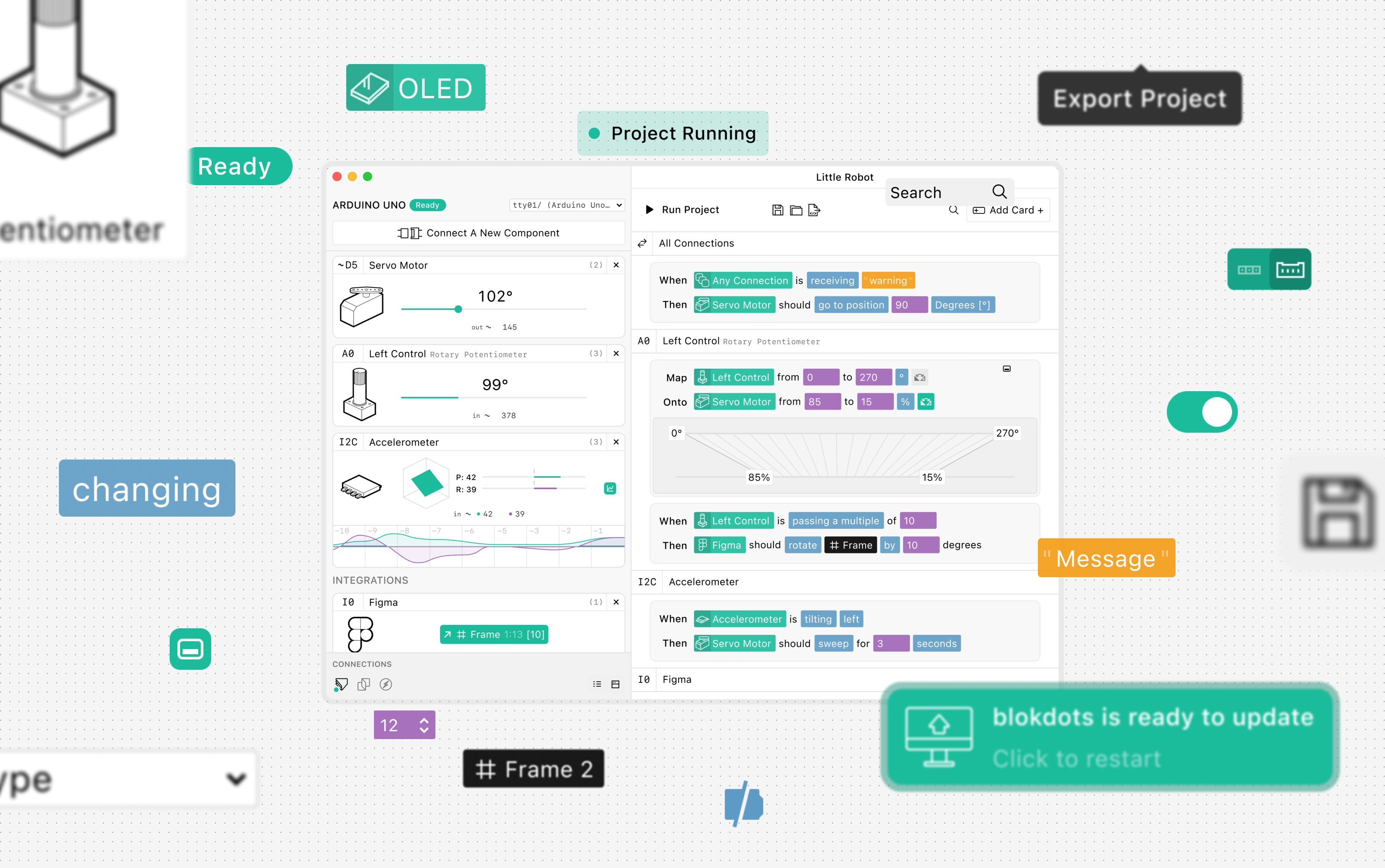
blokdots 2.0
Where we came from
With this latest release of blokdots 2.0, we made a lot of changes — not only related to performance and the backend setup but also quite visibly, we also completely updated the design and user interface.
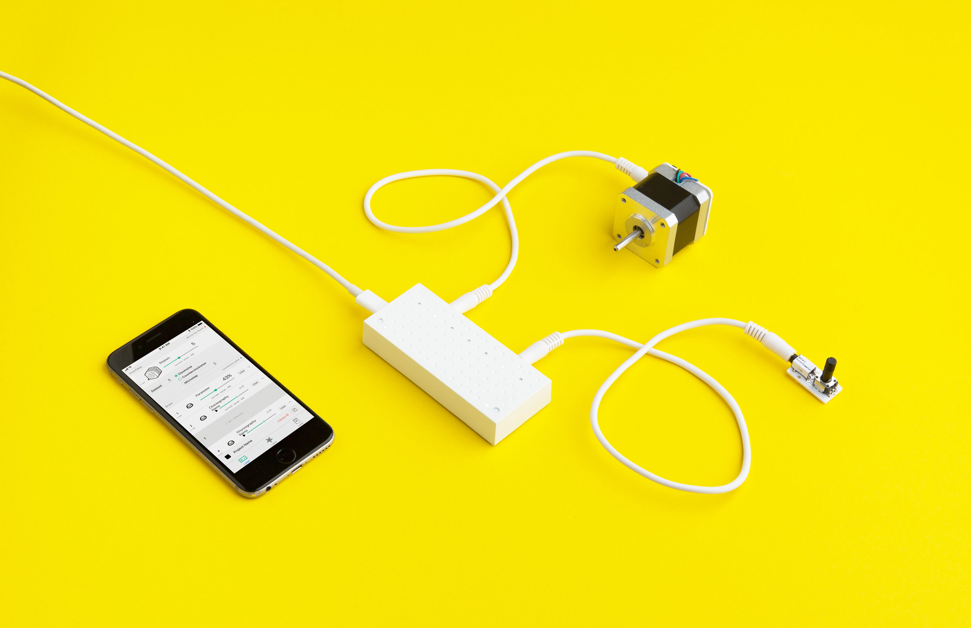
When blokdots started as my bachelor thesis in 2017, it was quite a different, integrated concept in comparison to what it is today. I designed a hardware toolkit along with the app. But when I started to create the app, I quickly realized that designing, developing, and most importantly shipping my own hardware is very difficult. Eventually, I decided to go with the existing Grove components, which mostly had the same benefits as my hardware: a plug-and-play ecosystem.
Together with my friend Christoph, we started to build the first version, the first MVP of the app — after I failed miserably doing it by myself. Going from there, the original app matched the original design’s main functionalities closely. blokdots as we know it today was born!
blokdots over the years
Over the years, blokdots evolved. The Grove setup, our personal interests, and also with Marcus joining us, a lot of new ideas were built and added to the software. When telling the story of why we did the redesign, I always say that it feels like we ‘duct-taped’ features onto our app. With integrations, the component wizard, new components that weren’t in the original concept, control components, and much more, a lot of things were added, but never really part of the concept, and one could eventually feel this missing link.
 blokdots 1.0. On the left you can see the project, on the right the connected components.
Through workshops and users giving us feedback, we could see that some assumptions we had were not working, or that new features did not have the space they deserved. And also, let’s not forget, that we learned a lot more about development in this time.
It was time to take all of this into account and fundamentally rethink how everything should work together.
Things we learned and how we solved it
In the new app version, we focussed on making the app less overwhelming and easier to understand. We also wanted to support working on a project even more. And, last but not least, we realized that connections to other tools – one of the most powerful features of blokots – should be even easier. So let’s dive into the main topics that we changed in this new major release of blokdots.
More simple
Blokdots aims towards an audience that is not familiar with hardware prototyping and coding. The app has always intended to support designers in creating prototypes without the help of engineers. This is why we added features like the component wizard to help find the right pin when connecting a component.
With 2.0, we intended to make things easier for our target audience even more. We understood that the two component lists we had were too confusing. The core of the project, the logic cards, were also displayed in a column layout, sorted by card creation. This led to a bad overview and losing track of your code constantly.
Overall, the app is now less overwhelming and more guiding. We finally merged the two component lists into one, cleaned up the cards and sort them now by the trigger component, and gave the wizard a more prominent flow, so that it helps users even better to find and connect the right component. To even get rid of some cards, we added the “+ And” functionality, which allows you to trigger multiple actions with just one input.
 blokdots 2.0 in a typical setup. Notice especially the single component list and single column layout of the cards.
More dynamic
When using blokdots, you want to create something interactive, and this should be represented in the app more! A lot of tiny design elements make the app feel more dynamic. If it’s just the proper hover states, displaying where you are or the less ‘wasted’ space by getting rid of the duplicated project component list.
But we wanted to give even more feedback while you are working on a project – immediate feedback is now a core principle of blokdots. Cards get highlighted when they trigger and help you to understand your project. The mapping card even displays the value right on the card when it changes, clearly visualizing how your components are responding. You can finally run a project without having a board connected. And the project re-runs itself when you change a card so that you do not have to worry about not forgetting to restart after a change anymore.
With all these features, we hope that creating a project feels even more exciting — and fun!
More connected
We realized that our connections to other tools like ProtoPie are highly appreciated and useful features. We also asked ourselves, as creative technologists, what would be needed to make blokdots more useful to us? So we made it even easier to use connections.
In the new app, the moment you open blokdots, all of the connections to ProtoPie, ProtoPie Connect, and Socket.IO are set up immediately. You can directly start to create your project. Also, you don’t have to worry anymore about which connection data might be coming, simply select the “Any/All Connections” component and listen or send to all of them at once.
We also understood that one of the most requested features has been to send values in a unit to other tools, so this works now too!
The new design
This has just been a very brief overview of some of the new features in blokdots 2.0. There are tons of other small improvements that we didn’t get into. We want to make prototyping easier for everyone and believe that this update has been a huge step towards our goal. We hope you like the new app as much as we do!


